


Product Design Case Study
Birchbox AI Support Chat
Today we have a prompt from Sharpen.Design to create a support chat for a makeup delivery service. For this case study I went looking for a service that didn't already have a support chat service and landed on Birchbox.
Birchbox is an online subscription service for makeup, which users can subscribe to to have multiple new makeup items delivered to their doors once a month to try and see if they like them. To create an AI powered chat we must look to the industry standard design principles and apply it to Birchbox, while adhereing to their design and branding.
DISCLAIMER: I am not affiliated in any way to Birchbox, or the creators of any makeup brands they sell. Any logos, products, or imagery shown all belong to their respective owners and are merely shown for the purpose of education and discussion. All interface mockups based on the current design language of the Birchbox interface are done by myself without compensation as a personal project and not for profit.
Client /
Case Study
Role /
Product Design
Agency /
N/A
Year /
2026

Looking through the existing website and support system that Birchbox has, it seems that they have a very simple and mobile friendly website. They at one point had a mobile app but they since have stopped support to focus on their website and making it accessible. For my support chat app though, I'm maily focused on their help center.


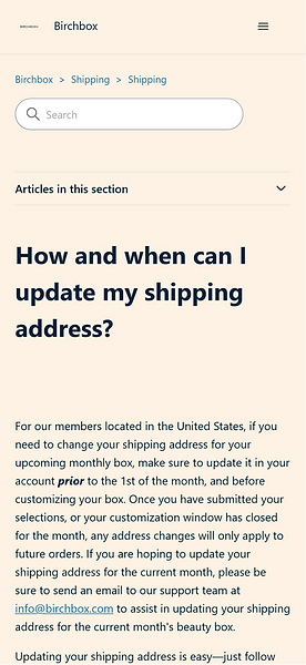
When looking at the help center for Birchbox, multiple things stood out to me.
The design language was different from the rest of the website. The main website mostly used plain white for backgrounds and a dark navy blue for its primary button color. It also used a beige color in small amounts with an orange color for highlights. While looking at the above examples, that beige color seems to be the only color used. That navy blue from before is now used as a hover state for the various support topics, and yet once inside the topic, the links are indistiguishable from the other text around it, AND don't have a hover state.
This breaks a few accessibility rules, so I'll replace the search box and topic buttons here with a chat box, using the colors I mentioned from outside the help center. This should help the app feel congruent with it's design language. Also for the following mockups, I'll be using Google Material 3 which is a design kit built into Figma's free tier.

After using the basic wireframe for a chat provided by Google Material, we can start adding in the components around this to turn it into an AI-Assisted Support Chat.

Moving into actually sending the chatbot a message. Here we see the chatbox moving in response to the user opening their keyboard to type in their support request.


As you can see in the example above, I've reused the splash logo from the Support Landing Page as the profile picture for the AI-Assistant. Also in terms of color choice, I've taken the beige color of the old Help Center and turned it into the chat bubble color from the chatbot, and the navy blue from the rest of the app as the color representing the user.
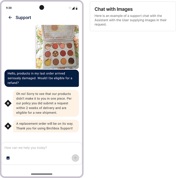
In this example, since in the old help center for Birchbox's damaged item policy required you to email them a picture of the broken/damaged product to receive compensation, I've included image upload capabilities to the chatbot.
Overall, I think I'm happy with the visual update while maintaining their design feel and color choices. What do you think about this idea? Would you be happy with this implementation using a more detailed prototype? I'm sure there would be so much more work to be done, and guardrails to be built to keep the Assistant focused and secure.
But anyways, I had fun playing around with this, and hope to do more like this in the future! Thanks for reading.